Wednesday’s SWTOR Livestream previewed the new additions coming to the game with Game Update 7.5, Desperate Defiance, but I want to focus on just one: the visual change to Hutta’s environment. One of my goals with this project is to examine the symbols in SWTOR, but not just their literal meaning, but also their connections to the worlds inside and outside of the game. The changes to Hutta does not involve fake space letters, but the meaning does involve something symbolic that I think is worth exploring: the “Yellow Filter”.
Color is an extremely powerful tool in visual storytelling. It can be used not only to differentiate locations, but also suggest a mood and meaning to places and the people in it. Within Star Wars lore, The Empire Strikes Back best demonstrates the use of color as a means to enhance the story. Hoth is “cool” white and blue; Dagobah is covered in “lush” greens and earth tones; and Bespin is primarily lit in reds that swing from “passionate” to “hellish.”
SWTOR is often staged in a similar way, but over the years it has also been influenced by other cinematic techniques popular at the time. Hutta is a case in point. The Hutta players have experienced since launch is bathed a bright yellow color grade. But why? Yellow can mean different things in different contexts, but I think we can agree Hutta is yellow to suggest the world’s corruption and pollution.
If we take a step back and look at how yellow grading is used in other media, we can see that SWTOR was likely inspired by movies and TV shows like Traffic and Breaking Bad which applied a yellow color grade to scenes set in Mexico. In those cases, this effect serves to make the action set there among the drug cartels feel not only more arid and hotter than scenes set in the United States, but corrupt and rotten as well.
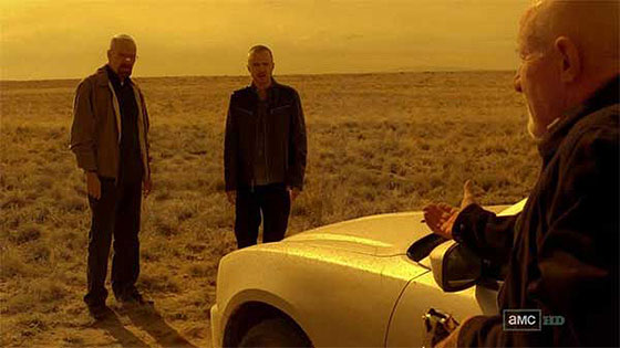
So, of course, I can see how the SWTOR of 2011 might have been inspired to use a similar visual shorthand for Hutta. But in the years since, the meaning of the yellow filter changed, and in many case it has become known as the “Mexican Filter.” Even if we leave aside the fact that casting locations in a yellow color key does not accurately represent their actual appearance, the filter has become used to imply that a location was not only hot and arid, but foreign, poor, different. And it did not go without notice that people who lived in the locations that get the yellow filter treatment from not only Mexico but also the Middle East and Asia almost always have brown skin.
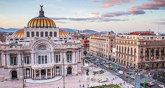
I am not saying that Yellow Hutta is racist and that the devs who made it are racists or anyone who prefers the original version is racist, but I do think that SWTOR is an evolving thing, and new players are experiencing aspects of its game for the first time well over a decade after it launched. I am glad that the team at Broadsword is willing to make changes and updates to the game, even after all this time. I believe that Hutta’s yellow filter has not aged well. It is at the very least clichéd and at the very worst reminds players of a filmmaking trope that has become lazy and often racist itself.
The updated Hutta of 7.5 shifts the color cast towards the earth toned end of spectrum. Certainly there is still plenty of yellow, but a bit more reds and browns instead of orange as well. In addition the cloud cover is now at ground level and the entire environment feels murky and clammy. I can see how many people might prefer the first iteration of the world. Certainly the strong primary color cast of the original Hutta is very dramatic and immediately marks it as an alien world, but, to me, the new Hutta feels sticky and I can practically smell the swamps and polluted air. And when we do see different colors, whether they are the nameplates of enemies or the neon sign of the cantina or an oil slicked rainbow, they pop a bit more.
I think the muted color tones and smog of the new Hutta does a better job of implying that the current environmental catastrophe is something that has been done to the planet by its Hutt overlords and not simply how it has been all along. To me that is more interesting symbolically than a hackneyed yellow filter that these days just says “hot and poor.”

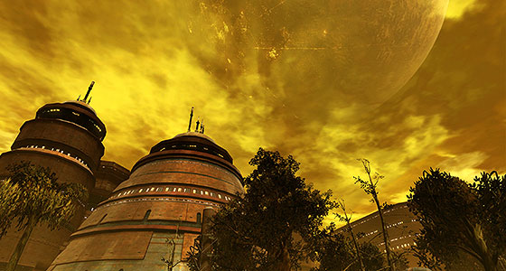
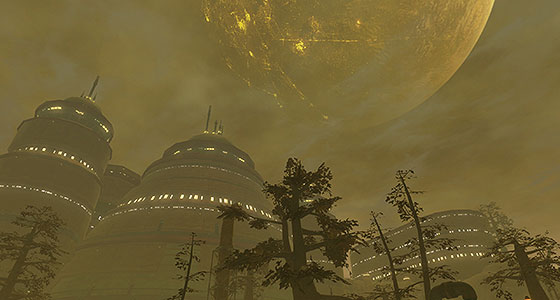
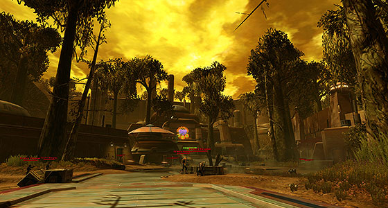


Ok I liked the yellow filter because I liked the idea that the alien clouds filtered the sunlight in strange ways. However just in isolation, it’s really hard to argue that the second of the last two screenshots isn’t more interesting visually.
AN aside, but did you ever do a post translating the signs in the museum at the very end of the IA storyline? When you figure out where the Star Cabal headquarters are, there are a series of about six museum type displays with some big artifact or statue and a sign describing it. I was very curious about what they said on my last playthrough, but not so curious that I was willing to screenshot all of them and translate them.
I have indeed translated that sign, in fact the screenshot I used came from the Star Cabal’s base as well.
I’m Making This Up As I Go
I was running heroics on Hutta recently and yes, it looks different and “cloudy” but I think they should have given that treatment to Quesh. I rather liked the yellow filter of Hutta, it really made the planet stand out from the other planets.