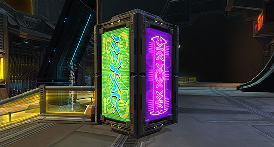
This week, let’s revisit two vivid posters that can be seen adorning Nar Shaddaa’s Huttball arena and several kiosks found on Carrick Station. I had given these a look back when I transated another pair of similar advertisements, but I decided to punt them down the road for reasons I’ll go into below.
These graphics recently reappeared in A Traitor Among the Chiss on the planet Copero as handles on bar taps. The colorful nature of these graphics make them appropriate for anything from Space Mountain Dew to Grape Fizzy Glug.
However, these posters show the danger in working with fake space letters that simply don’t translate into English. The bright green poster on the left combines two different alien languages: Huttese for the bold cyan letters in the foreground, and Futhork for the yellow letters in the back.
The Huttese font first appeared in the pod racing sequence of The Phantom Menace and has appeared in other Star Wars games beyond The Old Republic. While some Huttese such as graffiti in the Black Sun sector of Coruscant and the sign above Hutta departures gate of the Imperial Fleet can be translated into English, this particular example cannot. I doubt the letters have any specific meaning in the game, and simply may have been selected for how cool they look.
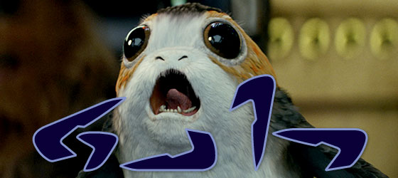
And I have no problem with that. It can be easily justified by assuming the writing is meant to be read as Huttese instead of English or Galactic Standard. And when designing typography with alien languages, the priority should be in how the final result looks rather than how it reads. Indeed, the Huttese font itself is a designer’s nightmare. Several of the letters use the exact same glyph, but simply flipped or rotated in different directions. If you wanted to write “Porg” in Huttese, all four letters of the word would share the same shape, with each letter oriented differently, and one having an extra accent. I’m quite certain that Hutts across the galaxy have a good laugh every time some poor soul tries to puzzle out their nigh unreadable language.

The poster also contains some Futhork writing. Although they are hard to make out in my translation, the exact same arrangement of letters can be found in another poster that can be seen on Nar Shaddaa and Corellia.
Next up is a purple sign written in Trade Federation Basic, which, like Huttese, was created for Episode I. As with the previous poster, this one does not have a meaningful translation. I suspect the glyphs used were selected not for any meaning but for how they fit into the poster’s design. For my version, I faithfully translated the letters, but adjusted their orientation to maintain the poster’s horizontal and vertical symmetry.
Even though these signs may not translate into English, it is to the designer’s credit that their meaning is obvious. If you should catch sight of them in the cantina in the Copero flashpoint and find yourself craving a refreshing energy drink or an ice-cold pop, then they’ve done their work!

