Longtime readers will know that I’m not usually one for hot takes. It’s been a more than week since SWTOR‘s last update, but I think it’s probably worth putting my reactions on the record. Consider this my lukewarm take on game update 6.2.1.
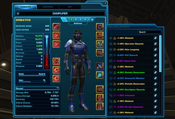
First let’s start with the elephant in the room, because relatively speaking, it takes up about as much space on our screens: the Amplifier sidebar. It is a real head-scratcher. The newly designed character sheet puts Amplifiers in a position of prominence that far, far outweighs their actual importance to players, while the information that actually matters is relegated to a tabbed table in the bottom left.

I don’t even know where to begin with this. The User Interface should, above all, account for how players will use it and make information and functions easier to access. I often check my Accuracy and Alacrity when swapping gear, I generally don’t care what Amplifiers I have. Additionally, putting the weapons smack dab in the middle of the column of armor slots in remarkably non-intuitive. I can’t tell you how many times last week I tried to equip a belt in my weapon slot.
I am all in favor of an improved Amplifier interface, and I have no issue with the cost of rerolling locked Amplifiers. The game needs credit sinks, and the players who most care about their Amps likely have the most cash to burn. I tell new players not to worry about Amplifiers at all; as they acquire maximum level gear, consider setting aside good mods with good Amps if they want, but, aside the daily reroll for Conquest points, I think the vast majority of players have no need to fuss with their Amplifiers.
The Amplifier window should not be a massive caboose that distracts players from the real reasons they want to access the character sheet.
This was not the only annoyance to be found in the latest patch. SWTOR game updates often come with new and unintended bugs. This time those bugs have affected Utilities and Tacticals that grant extra stacks of buffs. For example, the Tactical that is supposed to give Sage healers an extra jump of Wandering Mend currently has no effect, and the Force Harmonics Utility that should grant Shadows an extra charge of Force Potency is likewise ineffective. Pretty much every class has at least one spec affected, and it’s frustrating that we are into our second week of discussing which bad Tactical or normally subpar Utilities should be used instead while we await a hotfix.
Finally the update did bring some changes to Uprisings, Knights of the Eternal Throne’s forgotten group content. The Uprisings have been rebalanced for level 75, and I’m honestly glad to have more max-level content to romp around in. I am on the record as someone who enjoys Uprisings. The have some neat mounts and achievements to farm, the power-ups are fun and they are a nice change of pace from the Flashpoints I’ve run many times over the years. There, however, is legitimate confusion over how the difficulty designations of Uprisings and Flashpoints don’t align. A Storymode flashpoint is meant to be soloed, but a Storymode Uprising is meant for a group, and a Veteran Uprising has more in common with a Master Mode flashpoint. I think some nomenclature clarifications are in order.

While I haven’t tried any of the rebalanced Master Mode Uprisings yet, I have run a few Storymodes with a friend and they seem to fill the spot that the old school Heroic-4’s used to: quick, small group content where companions can fill in for players in a pinch. Even in 270 gear with mid-level companions, we were able to complete several Uprisings in 15-20 minutes without much fuss. The boss fights felt maybe a bit too long, and some mechanics chewed up companions while others had very little effect, but that’s always been the risk when subbing in companions in place of players.
If you’re tired of Hammer Station and the same old heroics, grab a friend and your favorite companions and try a few Uprisings. You’ll get to revisit some familiar locations, watch trash mobs explode like popcorn and hopefully have a laidback, good time. In the meantime, we await official word about whether the Character Sheet will be revised due to player feedback and when those frustrating bugs will be quashed.

It beats me why they didn’t at least make the list collapsible, so when you really want to check your amplifiers you click on it to expand it, and the rest of the time it doesn’t get in the way. As it is, it looks like an unwanted stepchild slapped onto the main character window, and I agree that it’s completely out of proportion. Would be interesting to hear what, if any, reasoning was behind that design choice.
(BTW, you didn’t really create Damplifier just for this screenshot, did you? 😀 )
Damplifier! Nimue, I didn’t even notice it! Thanks for the laser pointer. 😀
Intisar, maybe the busted-ness of tacticals and utilities explains what felt like more work, for me, in last night’s operation. Because I’m a clicker and truster of the system that’s worked in the past, in the heat of battle all I could suppose was players didn’t have all their gear or stims. I don’t notice the numbers not adding up from one week to the next.
I haven’t tried the rebalanced Uprisings yet, but look forward to them. A common naming system would certainly make more sense. Especially for newer players.
The new amplifier window is more a big black hole than handy. A tab to close it is really required. My theory is the Devs want us to know it’s there. When they introduced the non moveable, sales pitch window a few months back, it had to closed it every time you logged in on a toon. Now when closed, most of the time, it stays closed until the weekly reset. Current status of the amp interface is “training* players to know it’s available. My hope is this evolution will also happen with this new amplifier window.
Nice work, this blog. Thanks Int!